IafViewer
The IafViewer React component allows you to view a BIM model in 3D space and interact with it using a range of tools. This facility allows you to manipulate and explore 3D models using a powerful set of viewing tools and visual assists.
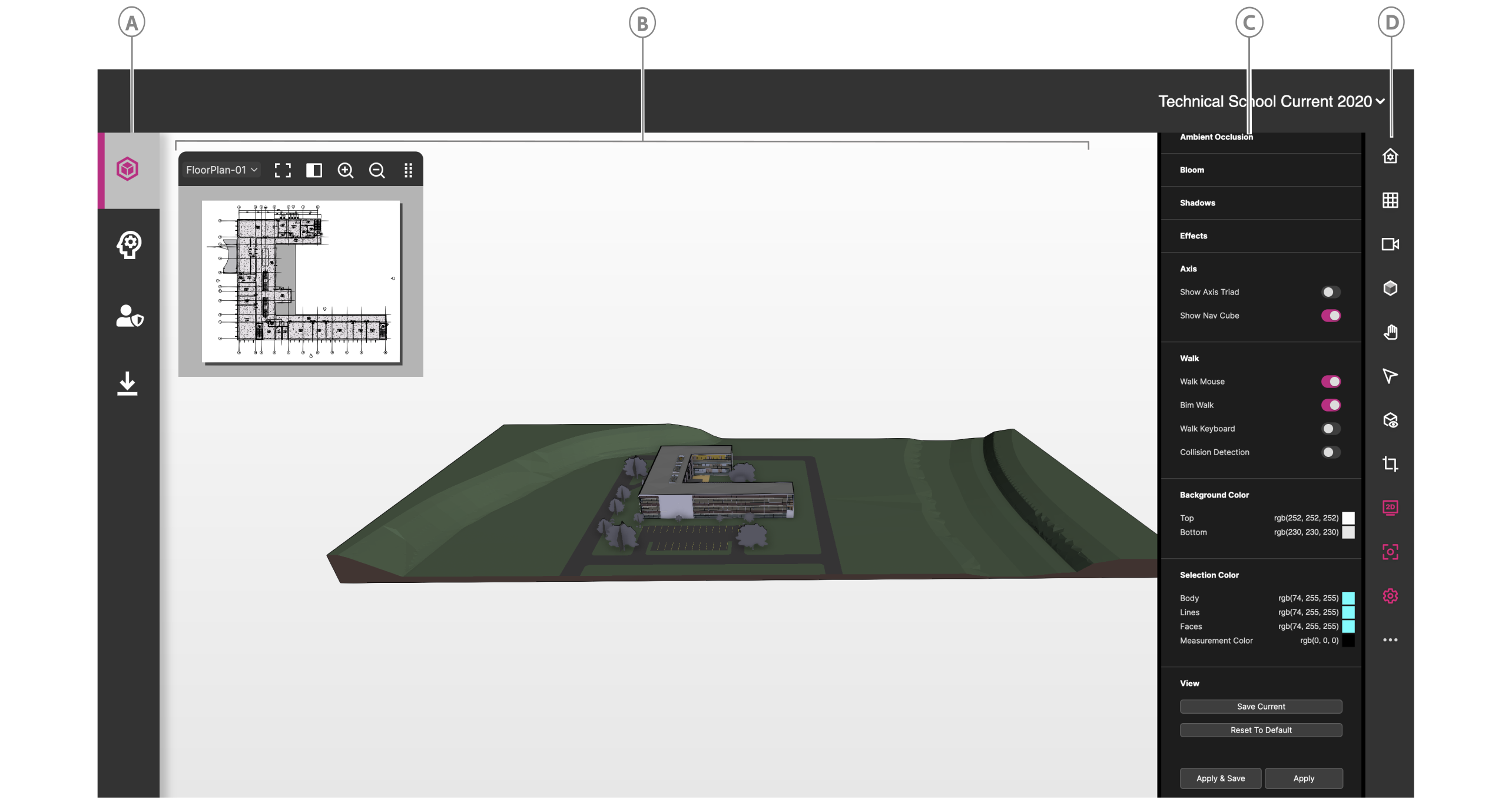
Figure: IafViewer interface elements
| Callout | Element | Description |
|---|---|---|
| A | Viewer page icon | Click to open the Viewer page |
| B | 3D viewer | Interact with the model |
| C | Configuration pane | When you click a tool in the toolbar, you can further configure the tool's settings in the Configuration pane. |
| D | Toolbar | Click a tool to use it in the IafViewer. For more information on each tool, see IafViewer toolbar icons |
IafViewer toolbar icons#
| Element | Icon | Description |
|---|---|---|
 | Reset view | Reset the viewer to the default coordinates. |
 | Projection | |
 | View | Click to select from the available views, such as front, back, top, and bottom views. |
 | Shading | Enable and configure model shading. |
 | Navigation | Select a navigation modality, such as pan, orbit, or walk view. |
 | Measurement and annotations | Measure the distance between two points and configure the measurement settings. Add annotations to the 3D model such as lines, geometrical shapes, text callouts, and graphics. |
 | Animations | Click to run animations. For more information, see Animations. |
 | Cutting Plane | Cut the model by a horizontal or vertical plane, either by coordinates or by point of mouse click. For more information, see Cutting Planes pane. |
 | 2D Viewer | View a flat 2D representation of the model. |
 | Focus Mode | Click to zoom in and focus on the selected model element. |
 | Viewer customization | Drag and drop the tools you want to appear in the toolbar for a given setting. |
 | Settings | Configure the general and effect settings. |
 | Visibility utilities | Isolate selected model elements, hide the selection, or show all model elements. This option does not appear in the toolbar by default; to enable it, from the toolbar, click the Settings icon, then enable Utilities. |
 | Model composition | Compose which parts of the model you want to load to optimize loading times for your use-case. For more information, see Model composition. |
React component#
For more information on installing, importing, and configuring the IafViewer React component, see IafViewerDBM component.
Utility function commands#
For more information on utility functions for the IafViewer component, see IafViewer commands.
Model composition#
2D and 3D file destructuring#
Prior to 4.3, Revit-derived projects were comprised of a single 2D file and a single 3D file. After the release of 4.3, Revit-derived projects are now comprised of an array of linked files. This change means that load times are now optimized. Segmenting the project into multiple 3D and 2D files allows the user to configure which parts of the model to load for their use-case.
Model Composition pane#
The Model Composition pane comprises the Compose On Demand and Designer View sections. Use the Compose On Demand section to configure which parts of the model to load, and use the Designer View section to view the source Revit project files and track which of the linked models are loaded and visible and which are not.
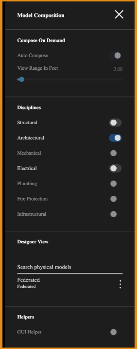
Figure: Model Composition pane
Compose on Demand configurations#
In the Compose On Demand section you can configure which parts of the model render, either by range in feet or by discipline, such as Structural and Electrical. You can also enable Auto Compose, which automates the composition.
The distance in feet allows the viewer to loading of segment / view / linked model if the linked model lies within the specified viewing range in feet. One import thing to note here is that Distance in Feet is used on segmented models for the decision making and not on individual assets in the model.
Loads linked model segments that are within the specified viewing range measure in feet.
| UI element | Description |
|---|---|
| Auto Compose | Enable to leave the model composition decision-making to the IafViewer and Graphics Service based on view parameters such as view position and the user's enabled disciplines, such as Structural and Electrical. |
| Distance in Feet | Set the range in feet that you want the viewer to load the model. |
| Structural | Enables structural elements |
| Architectural | Always enabled |
| Mechanical | Enables mechanical elements |
| Electrical | Enables electrical elements |
| Plumbing | Enables plumbing elements |
| Others | Enables all other unlisted disciplines |
Designer View#
Use the Designer View section to view how the original Revit project is structured in the Autodesk Revit Project as linked files. Track which of the linked models are loaded and visible and which are not.
Cutting Planes pane#
Focused Planes#
Use the Focused Planes section of the Cutting Planes pane to build a cutting plane box of a given size around the selected element or asset. As well as providing more efficient loading times, you can use cutting planes to quickly make visible a selected element that is obscured from view by other elements in the model.
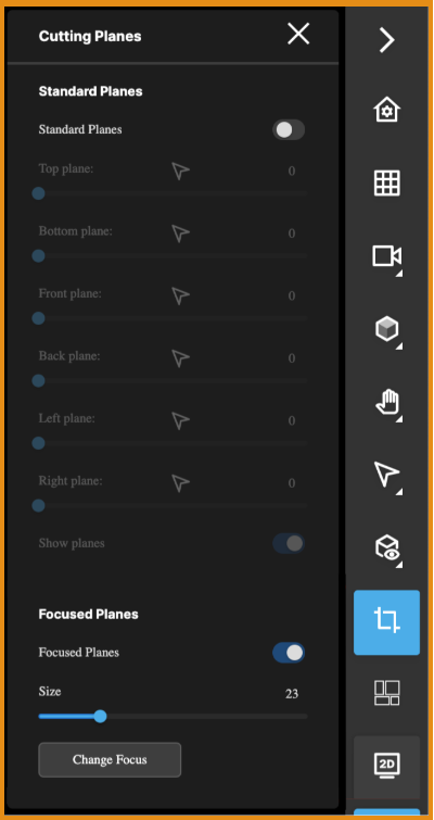
Figure: Cuttings Planes pane
| UI element | Description |
|---|---|
| Size | Sets the size of the cutting plane box around the selected element or asset |
| Change Focus | Changes the active selection subject in order to update the focused plane box |
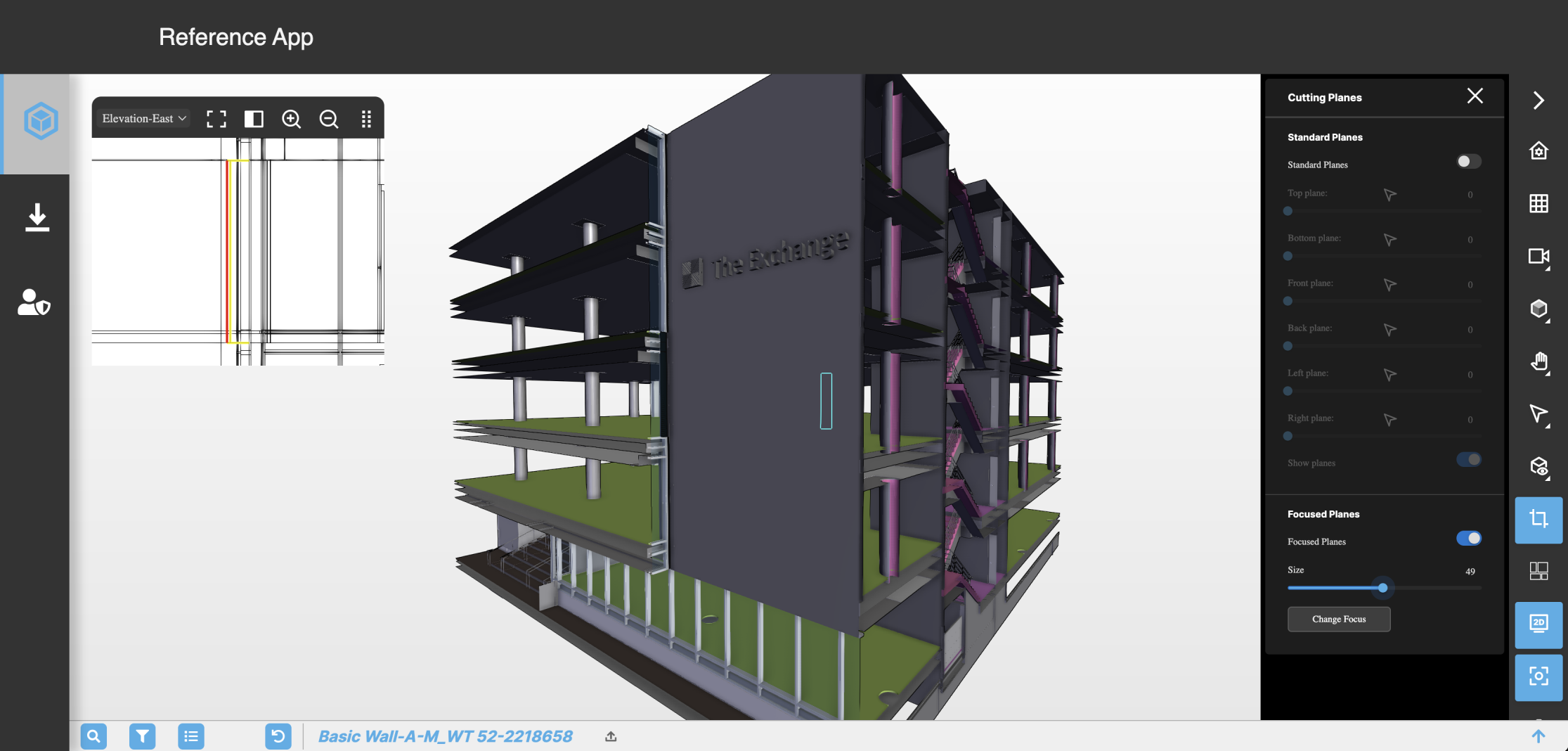 Figure: Example where model elements obstruct view of selected element
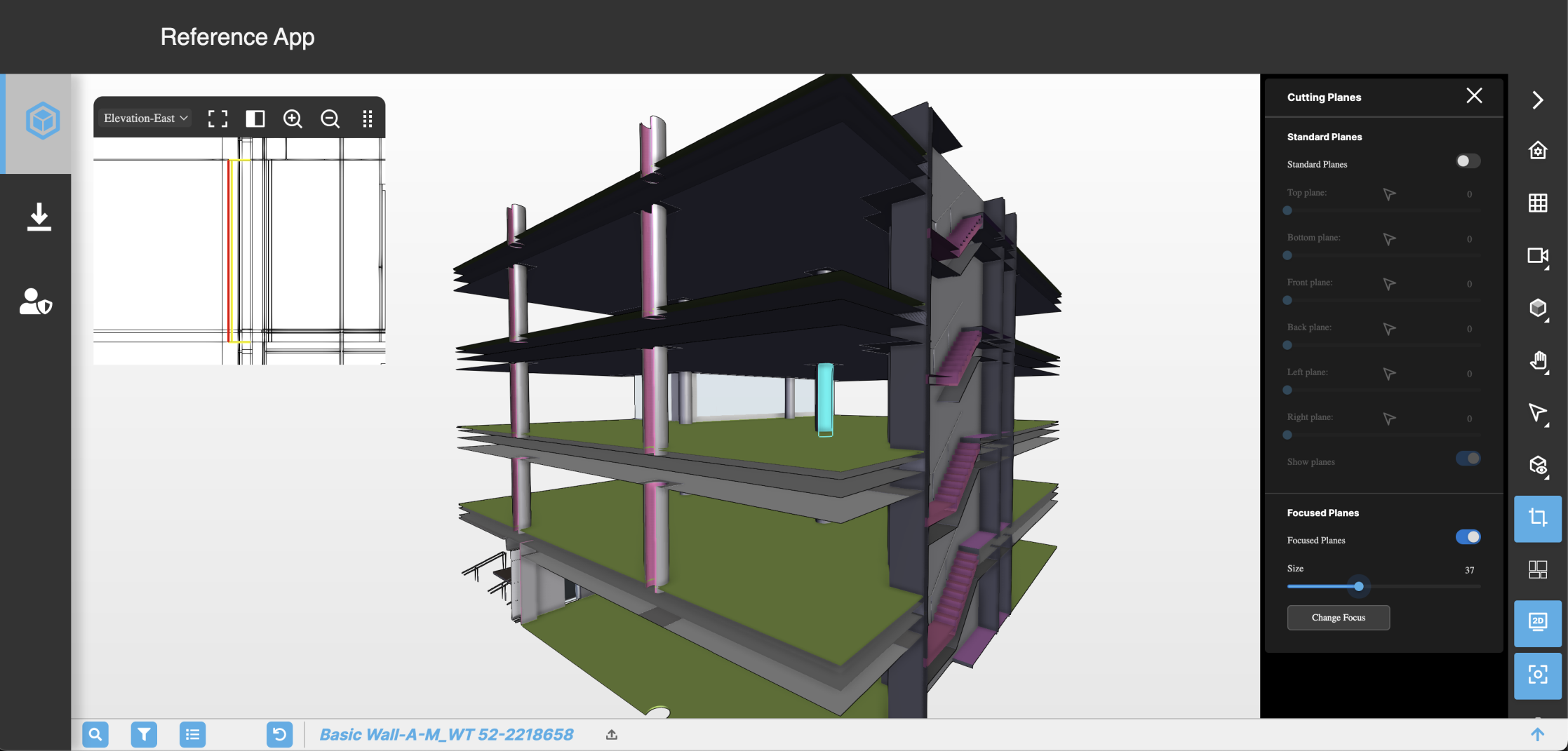 Figure: Example of focused planes revealing selected element
Annotations and measurement pane#
Use the Annotations and measurement pane to measure the distance between two points, as well as add annotations to the 3D model such as lines, geometrical shapes, text callouts, and graphics. You can export and import annotations.
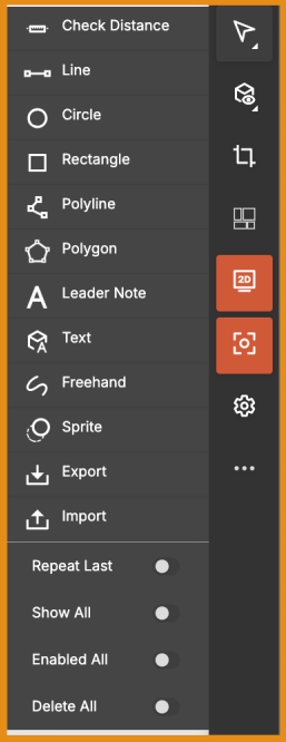
Figure: Annotations and measurement pane
| UI element | Name | Description |
|---|---|---|
 | Check Distance | Measures the distance between two nodes you click. |
 | Line | Click in the viewer to set first node, then the second click completes the line. Press the Escape key to cancel. |
 | Circle | Click in the viewer where you want the circle's centre, then drag to enlarge the circle. Release the mouse click to complete the circle. |
 | Rectangle | Click in the viewer where you want the upper-left corner of the rectangle, then click where you want the bottom-right corner to complete the shape. |
 | Polyline | Click in the viewer to set first node, then continue to add nodes. Right-click to complete the polyline. |
 | Polygon | Click in the viewer to set first polygon point, continue to add points, then right-click to auto-complete the final point. |
 | Leader Note | Creates a callout with text that points to a location. Click in the viewer to set the pointer, then type in the text box. Press the Shift and Enter keys to add a new line. |
 | Text | |
 | Freehand | Click to start, drag the mouse to draw the freehand sketch, then release the mouse click to complete. |
 | Sprite | Adds a graphic annotation using an image URL. Click in the viewer where you want the image, then in the text box, paste the image URL. Click outside the text box to complete. You can use png and gif files. |
 | Export | Exports your annotations. |
 | Import | Imports exported annotations. |
| Repeat Last | Repeats the previous annotation | |
| Show All | Show or hide all annotations | |
| Enabled All | Enable to select any annotation and move it or edit its properties. Disable if you are navigating the model and don't want the annotations to be editable. | |
| Delete All | Deletes all annotations |
Annotations examples#
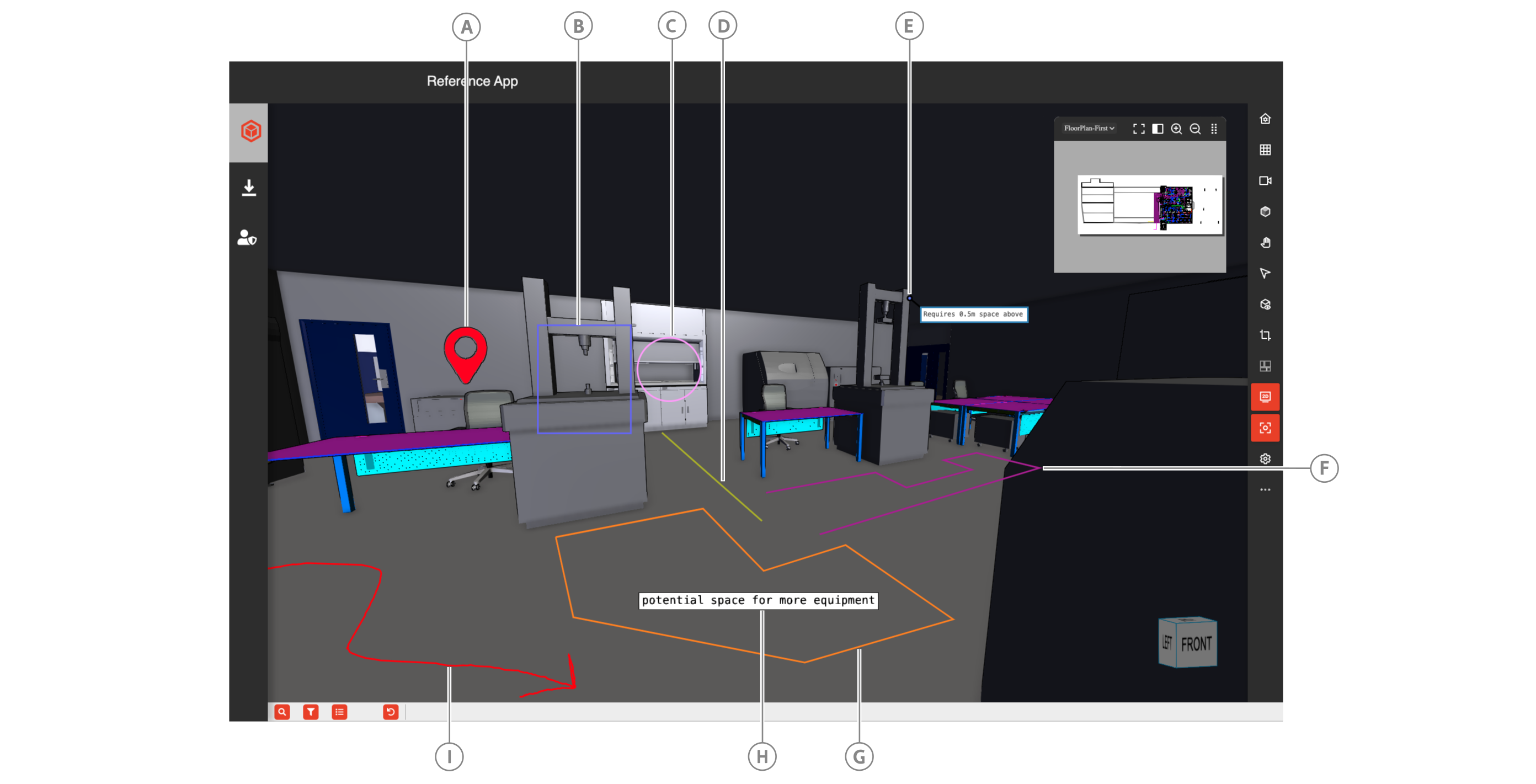
| Callout | Name |
|---|---|
| A | Sprite |
| B | Rectangle |
| C | Circle |
| D | Line |
| E | Leader Note |
| F | Polyline |
| G | Polygon |
| H | Text |
| I | Freehand |
Edit annotations panes#
You can edit any annotations in the viewer by clicking the annotation and editing the configuration in the panel.
Text edit pane#
You can change the text font, the text fill color and opacity, the text stroke color and thickness. There are also toggles to display or hide the text annotation, focus the viewer on the annotation, or make the annotation selectable or not.
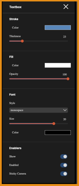
Figure: Text annotations edit pane
Geometry edit pane#
For geometry shapes, you can change the stroke color and thickness, as well as the fill color and opacity. There are also toggles to display or hide the geometry annotation, focus the viewer on the annotation, or make the annotation selectable or not.
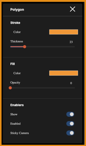
Figure: Geometry annotations edit pane
Animations#
You can layer various animations over 2D drawings in the IafViewer by passing a workflow prop that contains your workflows with animation scripts, which can animate model elements, graphics, and annotations.
Figure: Live animations workflow example
For more information on creating animation scripts and defining the workflow prop, see Animations.
Grid Helpers#
The Grid Helper feature in the IafViewer helps with spatial understanding of a 3D project layout by adding visual reference grids and axes to the scene. These visual tools help users with more effective navigating, aligning, and analyzing of 3D models.
Figure: Grid Helper visual references
Grid Helper pane#
The Grid Helper features are controlled in the Grid Helper pane which is accessed via the Settings icon.
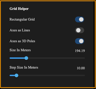
Figure: Grid Helper pane
In the Grid Helper pane, use the Rectangular Grid option to toggle the display of a rectangular grid of lines on the ground plane, aiding in alignment and measurements.
The Axes as Lines option enables traditional 2D axis representation, while the Axes as 3D Poles option provides vertical references in the scene.
The Size in Meters and Step Size in Meters sliders allow customization of the grid's overall dimensions and spacing, making it adaptable to projects of different scales.
React selection handling#
Selection handling refers to the handling of element click events in the IafViewer. To enhance React best practices, promote a more reactive data flow, and provide a more maintainable and efficient codebase, from platform v4.3 and later, implement the React selection handling enhancements.
Callback mechanism#
Any selection directly made within the IafViewer component triggers a callback to the application, passing the selected elements for processing. This ensures a more reactive response to user interactions and follows the principles of one-way data flow in React.
React selection handling workflow#
- User Interaction in IafViewer: In the IafViewer component user interface, a user makes element selections.
- Callback to application: Upon a selection event, the IafViewer component sends a callback to the application, providing details about the selected element.
- Application Response: The application receives the callback and processes the selected element, ensuring one-way data flow.
Note: For more information on using the IafViewer React component refer to the IafViewer page in the APIs section.