Reference app user configs
User configs define the interface for a given user group that logs in, such as the pages and actions that are available.
In the ReferenceApp, the following user configs are pre-configured in the scripts/NextScriptEngine/userconfigs folder:
| User config | User type that the interface is configured for |
|---|---|
iaf_dbm_contrib_uc.exp | Contributer |
iaf_dbm_projadmin_uc.exp | Project Admin |
iaf_dbm_review_uc.exp | Reviewer |
The following documentation breaks down a user config in the Reference App in detail.
User interface elements#
The following table describes the user interface elements that a user config defines:
Figure:Home page and navigation view
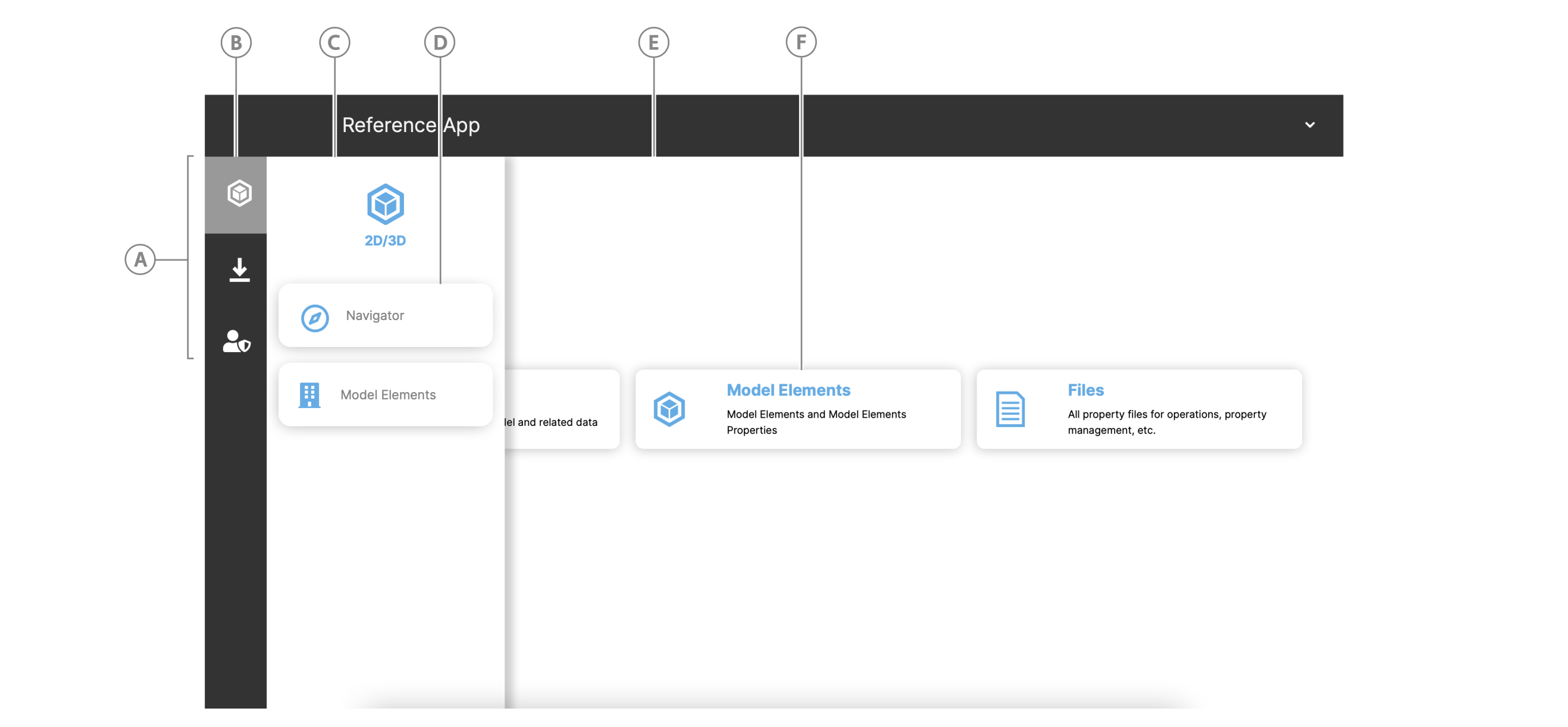
Table: UI elements that the user config configures
| Callout | Element | Description |
|---|---|---|
| A | Navigation view | Contains grouped page icons. |
| B | Navigation view icon | Icon that represents Grouped pages. Click the icon to open the drawer and view the grouped page buttons. |
| C | Navigation view drawer | Displays the page handler buttons in a grouped page when you click a navigation view icon |
| D | Grouped page handlers | Semantically grouped page handler buttons that appear in the same drawer. |
| E | Home page layout | You can define the home page layout type, such as a grid layout, and how it is composed in the Home page handler config. |
| F | Panel button | Each panel button uses the same component but has a different action handler that handles the content and click event. The reused component is configured in the Home page handler config and the handlers that defines each panel button component are defined in Home page handler actions. |
Page handers#
Use a handler to handle a click event from a navigation view drawer button or a homepage panel button. The handler describes an icon and title for the button, as well as the page component and path to use for the page as part of the button click event.
To add a page handler, simply add a handler to the "handlers" object in a user config.
For more information, see the following table with reference to the File page handler code that follows:
"handlers": { ... "<handler-name>": { "title": "<handler-title>", "actionTitle": "<homepage-action-button-title>", "icon": "<reference-to-used-icon>", "shortName": "<handler-short-name>", "description": "<handler-description>", "pageComponent": "<path-to-page-component>", "path": "<page-path-at-url-end>" }, ...}| Property | Type | Description |
|---|---|---|
| "handler-name" | Object | Name the handler property and add an object as its value. |
| - title | String | The page title |
| - actionTitle | String | If you want to add an action button to the homepage that goes to this page, add the reference to the action title here. |
| - icon | String | Reference to font awesome icon that appears for the page button in the navigation view drawer. |
| - shortName | String | Short name for the handler |
| - description | String | Page description |
| - pageComponent | String | Path to your React page component from the pageComponents folder |
| - path | String | Page path that appears after http://localhost:8086/reference#, such as /mypage |
File page handler example
The following handler handles the button that opens the Files page.
"handlers": { ... "uploadFile": { "title": "Files", "actionTitle": "UploadFile", "icon": "ion-ios-paper-outline icofont-2x", "shortName": "upload", "description": "Files", "pageComponent": "uploadFile/UploadFile", "path": "/uploadFile" }, ...}Home page handler#
The home page handler configures the home page and its action buttons.
Note: While other page handlers define the page component to use for that page's layout, you define the home page layout in the handler itself.
The home page handler object contains the following:
- Regular page handler properties described in Page handlers
- A Home page handler config, which is specific to defining the home page layout
- Home page interface elements and their handler actions
scriptTypesarray that contains references to scripts that execute at the page level
The following topics explore the home page handler config and the handler actions for interface elements on the homepage.
Note: To skip to a complete code example of a home page handler, see Complete home page handler example.
Home page handler config#
The home page handler config describes the layout and interface elements of the home page.
Note: To handle interface element events, see Home page handler actions.
"handlers.homepage": { ... //see Page handlers for these properties "config": { "layout": "grid", "className": "homepage", "rows": 3, "columns": 3, "panels": { "buttons": { "position": { "top": 2, "left": 1, "bottom": 4, "right": 4 }, "component": "CompactButtonBar", "actions": { //see Home page handler actions }, }, }, }, },},
| Property | Type | Description |
|---|---|---|
config | Object | Object that contains your home page handler configurations. |
- layout | String | The page layout type, such as "grid". |
- className | String | |
- rows | Number | Number of rows for your grid layout |
- columns | Number | Number of columns for your grid layout |
- panels | Object | Contains the configurations for interface elements you want to appear in the home page panels, such as buttons. |
- - <element-type> | String | The type of interface element you want to configure, such as "button" |
- - - position | Object | Position the interface element within the panel. |
- - - - top | Number | |
- - - - left | Number | |
- - - - bottom | Number | |
- - - - right | Number | |
- - - component | String | The name of the React component you want to use for the interface element |
- - - actions | Object | Action handlers for interface element events. Add an action for each element. For more information, see Home page handler actions. |
Home page handler actions#
You can give interface elements on the home page, such as buttons, handler actions, such as to navigate to a page. For more information on handler action objects, see the following handler action structure with reference to the table that follows:
..."handlers.homepage.config.panels.buttons.actions": { ... "<action-name>": { "allow": true, "icon": "your-icon.svg", "type": "navigate", "navigateTo": "<page-handler>", "title": "your-button-title", "text": "your-text-description-in-button-body" }, ...}| Property | Type | Description |
|---|---|---|
"action-name" | Object | Name the action property and add an object as its value. |
- allow | Boolean | Set to true to make the interface element visible |
- icon | String | Reference to a font awesome icon or an icon filename from the app.public.icons folder. |
- type | String | The action type. Enter "navigate" for a navigate action. |
- navigateTo | String | Enter the handler name of the page you want to navigate to. |
- title | String | Give the interface element a title |
- text | String | Add a text body description that displays in the interface element. |
Code example: Action that navigates to the Navigator page
..."handlers.homepage.config.panels.buttons.actions": { ... "Navigator": { "allow": true, "icon": "simple_navigator.svg", "type": "navigate", "navigateTo": "navigator", "title": "Navigator", "text": "Explore the building model and related data" }, ...}Complete home page handler example from project admin user config#
You can find this example at scripts/NextScriptEngine/userconfigs/iaf_dbm_projadmin_uc.exp in the Reference App.
"handlers" : { "homepage": { "title": "Homepage", "icon": "icofont-home", "shortName": "homepage", "description": "Home", "pageComponent": "dashboards/DashboardView", "path": "/homepage", "config": { "layout": "grid", "className": "homepage", "rows": 3, "columns": 3, "panels": { "buttons": { "position": { "top": 2, "left": 1, "bottom": 4, "right": 4 }, "component": "CompactButtonBar", "actions": { "Navigator": { "allow": true, "icon": "simple_navigator.svg", "type": "navigate", "navigateTo": "navigator", "title": "Navigator", "text": "Explore the building model and related data" }, "Model Elements": { "allow": true, "icon": "simple_assets.svg", "type": "navigate", "navigateTo": "modelelems", "title": "Model Elements", "text": "Model Elements and Model Elements Properties" }, "Files": { "allow": true, "icon": "simple_files.svg", "type": "navigate", "navigateTo": "uploadFile", "title": "Files", "text": "All property files for operations, property management, etc." } } } } }, "scriptTypes": [ "iaf_dashboard" ] },}Grouped pages#
The groupedPages object in a user config defines the page groupings that appear in the navigation view drawer and the navigation view icon that opens the drawer. A drawer button represents each grouped page you add.
"<page-group-name>": { "icon": "<icon-reference>", "position": 2, //icon order in nav view "pages": [ //array of grouped pages { "page": "<page-component-name>", "handler": "<page-handler-name>" } ]},| Property | Type | Description |
|---|---|---|
| "page-group-name" | Object | Name the page group property and add an object as its value. |
| - icon | String | Font awesome reference to icon that appears in the navigation view and above the page button in the navigation view drawer |
| - position | String | Position that the page icon appears in relation to other page icons in the navigation view order |
| - pages | Array of Object | Array of page buttons that appear in the navigation view drawer and their handlers |
| - - page | String | The React page component name |
| - - handler | String | Name of page handler to use |
File page page group example#
"Files": { "icon": "inv-icon-svg inv-icon-download", "position": 2, "pages": [ { "page": "uploadFile", "handler": "uploadFile" } ]},