IafViewerDBM
IafViewerDBM is a wrapper component currently used in Digital Twin to simplify the process of retrieving model files and data. By just passing in platform model JSON object, it takes care of loading graphic files, ID mapping and even 2D views (if exists) in the platform. It's the most commonly used viewer component and users usually don't need to use IafViewer directly.
How to use IafViewerDBM#
- In the React application that needs to use IafViewerDBM, add a npm package copy-webpack-plugin and then put the following in plugins section (an arry of plugins) in the webpack.config.js,
new CopyWebpackPlugin([ {from: 'node_modules/@dtplatform/iaf-viewer/dist/lib/', to: 'lib/', toType: 'dir'} ])- Add a line similiar to the following in the index.html or your index html file.
<script src="/your_app/lib/web_viewer.js"></script>- Create a component that renders IafViewerDBM within. Here's an example of a functional component:
const EnhancedIafViewerDBM = ({ model, sliceElementIds, colorGroups }) => {  const viewerRef = useRef()
return ( <div> <IafViewerDBM ref={viewerRef} model={model} serverUri={endPointConfig.graphicsServiceOrigin} sliceElementIds={sliceElementIds} colorGroups={colorGroups} selection={[]} /> </div> )}Props#
Data props#
| Prop | Type | Default value | Description | Required |
|---|---|---|---|---|
| model | NamedCompositeItem | undefined | Pass the model NamedCompositeItem, including _id, _name and _namespaces properties. | Required |
| modelVersionId | String | undefined | Accepts the version of the model. If not provided, the latest version would be used | Optional |
| modelComposition | Object | { initial: { Architectural: true }} | Configures which disciplines of the model to show or hide. Pass an object with an initial prop and its value as an object with discipline properties and corresponding Boolean values. Use one or more of the following discipline properies: Structural, Architectural, Mechanical, Electrical, Plumbing, FireProtection, Infrastructural, default. | Optional |
| serverUri | String | 'https://api.invicara.com/' | Specifies the URI of the graphics service origin | Required |
| toolbarSize | String | 'medium' | Sets the toolbar size. Enter "small", "medium", or "large". | Optional |
| showToolTip | Boolean | true | Value used to show/hide tooltip | Optional |
| sidePanelColor | Hex, RGB, color name | '#1D1D1D' | Sets the color of the side panel. ex: setting panel | Optional |
| selection | Array of ids | undefined | Array of selected element ids | Optional |
| sliceElementIds | Array of ids | undefined | Array of isolated element ids | Optional |
| hiddenElementIds | Array of ids | undefined | Array of hidden element ids | Optional |
| spaceElementIds | Array of ids | undefined | Array of element ids for spaces in the model | Optional |
| settings | Object | undefined | Object containing settings if saved | Optional |
| colorGroups | Array of Objects | Array of color group objects. Each object has a groupName property and a colors property with an array of color objects. Each color object has color, opacity, and elementIds properties. | Optional | |
| colorGroups[i].groupName | String | Enter a name for the color group. | Optional | |
| colorGroups[i].colors | Array of Objects | An array of color objects representing different colors within the group. | Optional | |
| colorGroups[i].colors[i].color | String | Enter a Hex or RGB value. | Optional | |
| colorGroups[i].colors[i].opacity | Number | Enter a decimal value between 0 and 1. | Optional | |
| colorGroups[i].colors[i].elementIds | Array of ids | An array of element ids to apply the color to. | Optional | |
| topics | Array of topics | undefined | Topics associated with the model | Optional |
| viewerResizeCanvas | Boolean | undefined | A flag to tell the viewer it needs to resize the canvas when the size of container of the viewer is changed | Optional |
| isIpaDev | Boolean | false | Controls whether the application is in development mode or not | Optional |
| units | String | undefined | Sets the unit of measurement for the model. Enter either "mm", "foot", "ft", "inch", "in", "meter", or "m". | Optional |
| cuttingPlaneValues | {x,y,z} | undefined | Specifies the minimum values for cutting planes along the x, y, and z axes. | Optional |
| onHoverIconColor | 'invert(40%) sepia(86%) saturate(6224%) hue-rotate(311deg) brightness(83%) contrast(101%)' | Sets the color of the toolbar icon on hovering panel. The default value is 'invert(40%) sepia(86%) saturate(6224%) hue-rotate(311deg) brightness(83%) contrast(101%)'. | Optional | |
| onActiveIconColor | 'invert(40%) sepia(86%) saturate(6224%) hue-rotate(311deg) brightness(83%) contrast(101%)' | Sets the color of the toolbar icon when it is active. ex: Focus Mode. | Optional | |
| toolbarColor | String | '#333333' | Sets the color of the toolbar. Enter a Hex Code, RGB Value, or a color name. | Optional |
| isShowNavCube | Boolean | true | Toggles the display of the navigation cube | Optional |
| showNotification | Boolean | true | Toggles the display of the notification | Optional |
| enableFocusMode | Boolean | true | Enables or disables the focus mode | Optional |
| enable2DViewer | Boolean | true | Toggles the display of the 2D viewer | Optional |
| btns | Object | undefined | Sets the buttons to display or not using Boolean values. Use the following button names as the properties: Orthographic, Analytics, viewer2D, Reset, Projection, View, Shading, Navigation, Measurement, Utilities, Settings. For each property, add an object with a display property and a Boolean value: { display: true }. | Optional |
| enableOptimizedSelection | Boolean | false | Enable or disable a function that efficiently selects nodeIds of 3D & 2D based on a selected asset element. It utilizes a performance-optimized algorithm to improve selection speed and unnecassary rerendering. | Optional |
| pdf2DUrl | null or String | Property used to store the URL of a PDF document related to 2D assets. This URL points to the location where the PDF can be accessed. | Optional | |
| workflow | Object | Define 2D animation workflows. For more information, see Animations. |
Callback props#
| Prop | Action that calls callback function | Returns |
|---|---|---|
| OnIsolateElementChangeCallback | The user isolates an element in the graphics viewer when they right-click the element, then click Isolate | The isolated element's id |
| OnSelectedElementChangeCallback | The user selects one or more elements in the graphics viewer | An updated array of the selected elements' ids |
| OnResetCallback | The user clicks the Reset button | true |
| OnHiddenElementChangeCallback | The user hides one or more elements in the graphics viewer | An updated array of the hidden elements' ids |
| saveSettings | The user clicks the Save & Close button in the Settings pane. | The IafViewer settings as a JSON object for your function to store in local storage. |
| OnResetCallback | The reset action is performed | |
| OnNotificationCallback | A notification is opened | Notification message |
| On2dToolbarConfigCallback | When the 2D toolbar is configured | Arrays of toolbar, measurement, view, navigation, shading, and manipulation options in the following order: toolbarList, measurementList, viewList, navigationList, shadingList, manipulateList |
| On3dToolbarConfigCallback | When the 3D toolbar is configured | Arrays of toolbar, measurement, view, navigation, shading, and manipulation options in the following order: toolbarList, measurementList, viewList, navigationList, shadingList, manipulateList |
| OnDefaultToolbarConfigCallback | When the default toolbar is configured | Arrays of toolbar, measurement, view, navigation, shading, and manipulation options in the following order: toolbarList, measurementList, viewList, navigationList, shadingList, manipulateList |
Animations#
You can layer various animations over 2D drawings in the IafViewer by passing a workflow prop that contains your workflows with animation scripts, which can animate model elements, graphics, and annotations.
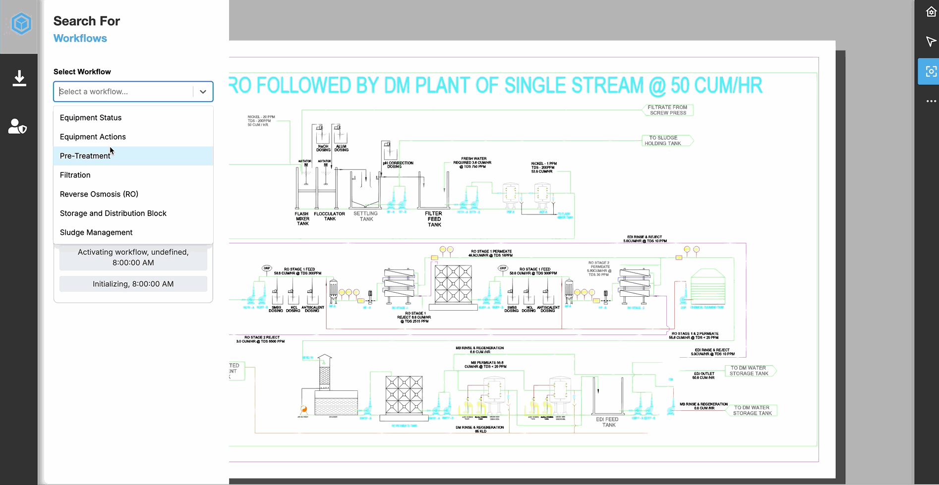
Figure: Live animations workflow example
Workflows consist of animation scripts and animation scripts consist of animation frames.
The nested structure of the animation prop is as follows. Scan the condensed example code, then click the following links for detailed information about each data structure and how to use it:
Condensed prop example
workflow: { //prop object active: Number, //the active workflow uuid list: [ //list of workflows //Animation workflow 1 { uuid: Number, //the workflow id timeInSeconds: Number //the workflow duration loop: Boolean, //loops the animations script: [ //array that contains the animation scripts //Animation script 1 { uuid: '', //the animation script's id elementIds: [Number], //ids of the elements to overlay with the animation type: '', //type of animation frames: [ //array of animation frames //Animation frame 1 { //specific frame properties } ] }, ] } ]}
For a complete example of a prop with workflows, animation script and their frames, see Complete prop example.
Animation prop#
The main prop contains the array of workflows and an active property to indicate which workflow to use:
Animation workflow example
workflow: { active: 1, list: [ //first workflow { uuid: 1, timeInSeconds: 4.5 loop: true, script: [ //animation scripts for workflow here ] }, //more workflow objects ]}| Property | Type | Description |
|---|---|---|
| workflow | Object | The workflow prop you pass as an argument to the IafViewer component |
| workflow.active | Number | The active animation workflow's uuid |
| workflow.list | Array of Object | Array of animation workflows. A workflow is a layer of animations that overlays a 2D model drawing. For more information, see Animation workflows |
Animation workflows#
Add workflows to the list array as objects with the following properties:
Animation workflow example
list: [ //first workflow { uuid: 1, timeInSeconds: 4.5 loop: true, script: [ //animation scripts for workflow here ] }, //more workflow objects ]| Property | Type | Description |
|---|---|---|
| uuid | Number | Workflow uuid |
| timeInSeconds | Number | The animation workflow's time in seconds |
| loop | Boolean | Use a Boolean value to make the animations loop or not |
| script | Array of Object | Array of animation scripts that make up the workflow. For more information, see Animation scripts |
Animation scripts#
There are many animation script types, such as markup annotations, sprites, scale, rotation, translation, opacity, and color animations, and each animation type has its own set of frame properties.
Add animation scripts to an animation workflow's script array as objects with the following properties:
Animation script example
{ //in animation workflow object script: [ { uuid: 'WaterSoftnerTank.293.1', elementIds: [1], type: "Sprite", frames: [ //add frames here ] }, //more animation script objects ]}| Property | Type | Description |
|---|---|---|
| script.uuid | Number | Animation script uuid |
| script.type | String | Animation script type, such as "Markup", "Sprite", "Scale", "Rotation", "Translation", "Opacity", or "Color" |
| script.elementIds | Array of Number | One or more ids of the model elements in the 2D drawing you want to overlay the animation |
| script.frames | Array of Object | Array of animation frames for the animation script. Each animation script type has its own set of frame properties. For more information, see Animation script types and their frame properties. |
Animation script types and their frame properties#
There are various animation types and each type has frame properties specific to that type.
For more information, see the following animation script types and their frame properties:
Sprite#
Use the Sprite animation type to add a graphic annotation using an image URL. You can use png and gif files.
Sprite animation types can use the frame properties demonstrated in the following example and property table:
Sprite animation object example
{ uuid: 'WaterSoftnerTank.293.1.Sprite', elementIds: [293], type: "Sprite", frames: [ { type: "Gif", size: 1, image: "/reference/mycompany/sprites/p-n-id/Water_Softener_Tank/Water_Softener_Tank.gif", alignment: "Center", autoScale: true, blend: 0.1 } ] }, Table: Sprite frame properties
| Property | Type | Description |
|---|---|---|
| type | String | Enter "Gif" or "Png". |
| size | Number | Set the size of the Sprite. |
| image | String | Enter an image path |
| alignment | String | Align the Sprite in relation to the model element with the following keywords: "Center", "LowerLeft", "LowerRight", "LowerCenter", "UpperLeft", "UpperRight", "UpperCenter". |
| autoScale | Boolean | Autoscale the Sprite to the model element. |
| blend | Number | Blends the opacity of the Sprite. Enter a decimal number between 0.0 and 1.0 to set the transparency-opacity value. |
Markup#
You can add and animate markup annotations such as Leader Notes, Text, Line, Circles, Rectangles, and Crosses.
Leader Note#
{ uuid: 21, elementIds: [303], type: "Markup", frames: [ { type: "LeaderNote", size: , text: "Your text here", blend: 0.5, status: "Success", strokeColor: { r: 0 , g: 255 , b: 0}, fillColor: { r: 0 , g: 200 , b: 0}, fillOpacity: 1.0, shiftPercent: , blink: false, alignment: "Center", } ]}, | Property | Type | Description |
|---|---|---|
| type | String | Enter "LeaderNote". |
| size | Number | Set the Leader Note size. |
| text | String | Add text to the Leader Note. |
| blend | Number | Blends the opacity of the Leader Note. Enter a decimal number between 0.0 and 1.0 to set the transparency-opacity value. |
| status | String | Displays a status graphic based on the string you enter: "Normal", "Warning", "Error", "Success". |
| strokeColor | {r, g, b} | Sets the Leader Note stroke color. The red, green, and blue values can range from 0 to 255. |
| fillColor | {r, g, b} | Sets the Leader Note fill color. The red, green, and blue values can range from 0 to 255. |
| fillOpacity | Number | Sets the Leader Note fill opacity. Enter a decimal number between 0.0 and 1.0 to set the transparency-opacity value. |
| shiftPercent | Number | Enter a number between 0.0 and 100 to set the Leader Note shift percent. |
| alignment | String | Align the Leader Note in relation to the model element with one of the following keywords: "Center", "LowerLeft", "LowerRight", "LowerCenter", "UpperLeft", "UpperRight", "UpperCenter". |
| blink | Boolean | Makes the Leader Note blink on and off in a loop. |
Text#
{ uuid: 21, elementIds: [303], type: "Markup", frames: [ { type: "Text", text: "Your text here", size: 1, autoScale: true, status: "Error", strokeColor: { r: 255 , g: 0 , b: 0}, fillColor: { r: 200 , g: 0 , b: 0}, fillOpacity: 1.0, shiftPercent: , blend: 0.8, } ]}, | Property | Type | Description |
|---|---|---|
| type | String | Enter "Text". |
| text | String | Add text. |
| size | Number | Set the text size. |
| autoScale | Boolean | Autoscale the text to the model element. |
| status | String | Displays a status graphic based one of the following strings you enter: "Normal", "Warning", "Error", "Success". |
| strokeColor | {r, g, b} | Sets the text stroke color. The red, green, and blue values can range from 0 to 255. |
| fillColor | {r, g, b} | Sets the text fill color. The red, green, and blue values can range from 0 to 255. |
| fillOpacity | Number | Sets the text fill opacity. Enter a decimal number between 0.0 and 1.0 to set the transparency-opacity value. |
| shiftPercent | Number | Enter a number between 0.0 and 100 to set the text shift percent. |
| blend | Number | Blends the opacity of the text. Enter a decimal number between 0.0 and 1.0 to set the transparency-opacity value. |
Line#
{ uuid: 21, elementIds: [303], type: "Markup", frames: [ { type: "Line", blink: false, alignment: "DiagonalAscend", blend: 0.5, //status: , scale: 1, strokeColor: { r: 0 , g: 0 , b: 0} } ]}, | Property | Type | Description |
|---|---|---|
| type | String | Enter "Line". |
| blink | Boolean | Makes the Line blink on and off in a loop. |
| alignment | String | Align line annotations with the following key words: "Left", "Right", "Top", "Bottom", "DiagonalAscend", "DiagonalDescend", "CenterVertical", "CenterHorizontal". |
| blend | Number | Blends the line opacity. Enter a decimal number between 0.0 and 1.0 to set the transparency-opacity value. |
| status | String | Displays a status graphic based one of the following strings you enter: "Normal", "Warning", "Error", "Success". |
| scale | Number | Scale the Line. A value of 1 is the original scale. |
| strokeColor | {r, g, b} | Sets the line stroke color. The red, green, and blue values can range from 0 to 255. |
Circle#
{ uuid: 21, elementIds: [303], type: "Markup", frames: [ { type: "Circle", blink: false, blend: 0.8, //status: , scale: 1, strokeColor: { r: 0 , g: 0 , b: 0}, fillColor: { r: 100 , g: 150 , b: 255}, fillOpacity: 0.5 } ]}, | Property | Type | Description |
|---|---|---|
| type | String | Enter "Circle". |
| blink | Boolean | Makes the Circle blink on and off in a loop. |
| blend | Number | Blends the Circle opacity. Enter a decimal number between 0.0 and 1.0 to set the transparency-opacity value. |
| status | String | Displays a status graphic based one of the following strings you enter: "Normal", "Warning", "Error", "Success". |
| scale | Number | Scale the Circle. A value of 1 is the original scale. |
| strokeColor | {r, g, b} | Sets the Circle stroke color. The red, green, and blue values can range from 0 to 255. |
| fillColor | {r, g, b} | Sets the Circle fill color. The red, green, and blue values can range from 0 to 255. |
| fillOpacity | Number | Sets the Circle fill opacity. Enter a decimal number between 0.0 and 1.0 to set the transparency-opacity value. |
Rectangle#
{ uuid: 26, elementIds: [305], type: "Markup", frames: [ { type: "Rectangle", status: "Error", blink: true, blend: 0.8, scale: 1, strokeColor: { r: 0 , g: 0 , b: 0 }, fillColor: { r: 255 , g: 0 , b: 0 }, fillOpacity: 1.0 } ]},| Property | Type | Description |
|---|---|---|
| type | String | Enter "Rectangle". |
| blink | Boolean | Makes the Rectangle blink on and off in a loop. |
| blend | Number | Blends the Rectangle opacity. Enter a decimal number between 0.0 and 1.0 to set the transparency-opacity value. |
| status | String | Displays a status graphic based one of the following strings you enter: "Normal", "Warning", "Error", "Success". |
| scale | Number | Scale the Rectangle. A value of 1 is the original scale. |
| strokeColor | {r, g, b} | Sets the Rectangle stroke color. The red, green, and blue values can range from 0 to 255. |
| fillColor | {r, g, b} | Sets the Rectangle fill color. The red, green, and blue values can range from 0 to 255. |
| fillOpacity | Number | Sets the Rectangle fill opacity. Enter a decimal number between 0.0 and 1.0 to set the transparency-opacity value. |
Cross#
{ uuid: 25, elementIds: [300], type: "Markup", frames: [ { type: "Cross", status: "Error", blink: true, scale: 1, blend: 0.8, strokeColor: { r: 255 , g: 0 , b: 0 } } ]},| Property | Type | Description |
|---|---|---|
| type | String | Enter "Cross". |
| blink | Boolean | Makes the Cross blink on and off in a loop. |
| blend | Number | Blends the Cross opacity. Enter a decimal number between 0.0 and 1.0 to set the transparency-opacity value. |
| status | String | Displays a status graphic based one of the following strings you enter: "Normal", "Warning", "Error", "Success". |
| scale | Number | Scale the Cross. A value of 1 is the original scale. |
| strokeColor | {r, g, b} | Sets the Cross stroke color. The red, green, and blue values can range from 0 to 255. |
| fillColor | {r, g, b} | Sets the Cross fill color. The red, green, and blue values can range from 0 to 255. |
| fillOpacity | Number | Sets the Cross fill opacity. Enter a decimal number between 0.0 and 1.0 to set the transparency-opacity value. |
Opacity#
Use an Opacity animation script to set the opacity of a model element. Set the animation script's type property to "Opacity".
You can only pass decimal numbers between 0.0 and 1.0 as frame properties, which is the scale between 0% and 100% opacity.
Opacity animation object example
{ uuid: 'ServiceWaterTank.295.1.Sprite', elementIds: [295], type: "Opacity", frames: [ 0.5 ]}, To have the opacity level change over the time loop, you can pass multiple value:
frames: [ 0.0, 0.5, 1.0 ]Color#
Use Color animation scripts to change the color of a model element. Set the type property to "Color" and pass an RGB object with your red, green, and blue values from 0 to 255.
Color animation script example
{ uuid: "Mixer.298.Color", elementIds: [298], type: "Color", frames: [ {r: 0, g: 255, b: 0} ],}, To have the color change over the time loop, you can pass multiple RGB objects. The following example shows the element becomming more green each frame:
Multiple color frames example
frames: [ {r: 0, g: 10, b: 0}, {r: 0, g: 50, b: 0}, {r: 0, g: 100, b: 0}, {r: 0, g: 150, b: 0}, {r: 0, g: 200, b: 0}, {r: 0, g: 255, b: 0}, ],You can also pass programatic RGB values:
Programatic color frames example
frames: [ this._rgbRandom(), this._rgbRandom(), this._rgbRandom(), this._rgbRandom(), this._rgbRandom() ],Translation#
Use a Translation animation script to move a model element or annotation in space using x, y, and z coordinates. Set the type property to "Translation" and pass a coordinates object with your x, y, and z values.
To move a model element or annotation, pass the first frame as the baseline coordinates {x: 0, y: 0, z: 0}, then for a subsequent frame, set the destination coordinates.
| Coordinate | Description |
|---|---|
| x | Moves the object on the x-axis. Positive numbers move the object to the right and negative numbers to the left. |
| y | Moves the object on the y-axis. Positive numbers move the object up and negative numbers move it down. |
| z | Rotates the object from its starting orientation in degrees. |
The following example jumps a model element to the upper-right:
Coordinate frames example
{ uuid: 22, elementIds: [302], type: "Translation", frames: [ {x: 0, y: 0, z: 0}, //starting coordinates {x: 300, y: 300, z: 0} //destination coordinates ], },For a more fluid animation, add more frames with shorter distances. The following example shows the model element moving more fluidly to the bottom-left of its starting position:
Fluid coordinate frames example
{ uuid: 22, elementIds: [302], type: "Translation", frames: [ {x: 0, y: 0, z: 0}, {x: -50, y: -50, z: 0}, {x: -100, y: -100, z: 0}, {x: -150, y: -150, z: 0}, {x: -200, y: -200, z: 0}, {x: -250, y: -250, z: 0}, {x: -300, y: -300, z: 0} ], },You can use logic to create an array of Translation frames programatically. The following example creates an array that will program the object to move down and right one to a final destination of {x: 100, y: -100, z: 0} and moving one coordinate each frame in the time set for the workflow:
Programatic Translation coordinate frames example
{ uuid: 22, elementIds: [302], type: "Translation", frames: Array.from({length: 100}, (_, i) => ({x: (i + 1), y: (i - 1), z: 0}))},Rotation#
Use a Rotation animation script to rotate a model element or annotation through 360 degrees using z coordinates. Set the type property to "Rotation" and pass a coordinates object with your x, y, and z values.
Simple Rotation coordinate frames example
{ uuid: 21, elementIds: [298], type: "Rotation", frames: [ {x: 0, y: 0, z: 0}, {x: 0, y: 0, z: 60}, {x: 0, y: 0, z: 120}, {x: 0, y: 0, z: 180}, {x: 0, y: 0, z: 240}, {x: 0, y: 0, z: 300}, {x: 0, y: 0, z: 360}, //or 0 ]},You can use logic to create an array of frames programatically. The following example creates an array that will program the object to rotate six times in the time set for the workflow:
Programatic Rotation frames example
{ uuid: 21, elementIds: [298], type: "Rotation", frames: Array.from({length: 36}, (_, i) => ({x: 0, y: 0, z: (i + 1) * 60}))},Scale#
Use a Scale animation script to scale a model element or annotation. Set the type property to "Scale" and pass a coordinates object with your x, y, and z values.
For example, the following example uses the first frame to set the scale as its original scale of 1 and in the following frame scales it up to 1.5 times the original scale:
Simple Scale coordinate frames example
{ uuid: 24, elementIds: [303], type: "Scale", frames: [ {x: 1, y: 1, z: 1}, {x: 1.5, y: 1.5, z: 1.5} ],},Complete prop example#
The following example demonstrates two workflows with three animations each:
workflow: { active: undefined, list: [ //workflow 1 { uuid: 1, timeInSeconds: 4.5 loop: true, script: [ //animation script that adds a gif to a model element { uuid: 'WaterSoftnerTank.293.1.Sprite', elementIds: [293], type: "Sprite", frames: [ { type: "Gif", h size: 1, image: "/reference/invicara/sprites/p-n-id/Water_Softener_Tank/Water_Softener_Tank.gif", alignment: "Center", autoScale: true, blend: 0.1 } ] }, //animation script that adds a Leader Note to a model element { uuid: 20, elementIds: [303], type: "Markup", frames: [ { type: "LeaderNote", size: , text: "Your text here", blend: 0.5, status: "Success", strokeColor: { r: 0 , g: 255 , b: 0}, fillColor: { r: 0 , g: 200 , b: 0}, fillOpacity: 1.0, shiftPercent: , blink: false, alignment: "Center", } ] }, //animation that adds a circle shape { uuid: 21, elementIds: [303], type: "Markup", frames: [ { type: "Circle", blink: false, blend: 0.8, scale: 1, strokeColor: { r: 0 , g: 0 , b: 0}, fillColor: { r: 100 , g: 150 , b: 255}, fillOpacity: 0.5 } ] }, ] }, //workflow 2 { uuid: 2, timeInSeconds: 4.5, loop: true, script: [ //animation script that moves a truck model element to the right { uuid: 'wf-3.translate.sludge.truck.add.frame.302', elementIds: [302], type: "Translation", frames: [ {x: 0, y: 0, z: 0}, {x: 200, y: 0, z: 0} ], }, //animation script that makes a model element more transparent { uuid: 25, elementIds: [286], type: "Opacity", frames: [ 0.5 ] }, //animation script that rotates a model element six times { uuid: 26, elementIds: [298], type: "Rotation", frames: Array.from({length: 36}, (_, i) => ({x: 0, y: 0, z: (i + 1) * 60})) }, ] }, ]}