User interface overview
The ReferenceApp user interface appears differently depending on the user that logs in. The interface elements are generally the same but the user interface pages and actions available to the user depend on the user config.
Depending on the user group that the logged-in user belongs to, such as an Admin user that belongs to the Admin user group, the user interface pages and actions appear as configured in that user group's user config.
Note: For better understanding of a user config's source code with the example of the Admin user config, see user config.
The following user interface elements appear for the Admin user config that is defined in the ReferenceApp:
Figure: ReferenceApp interface elements
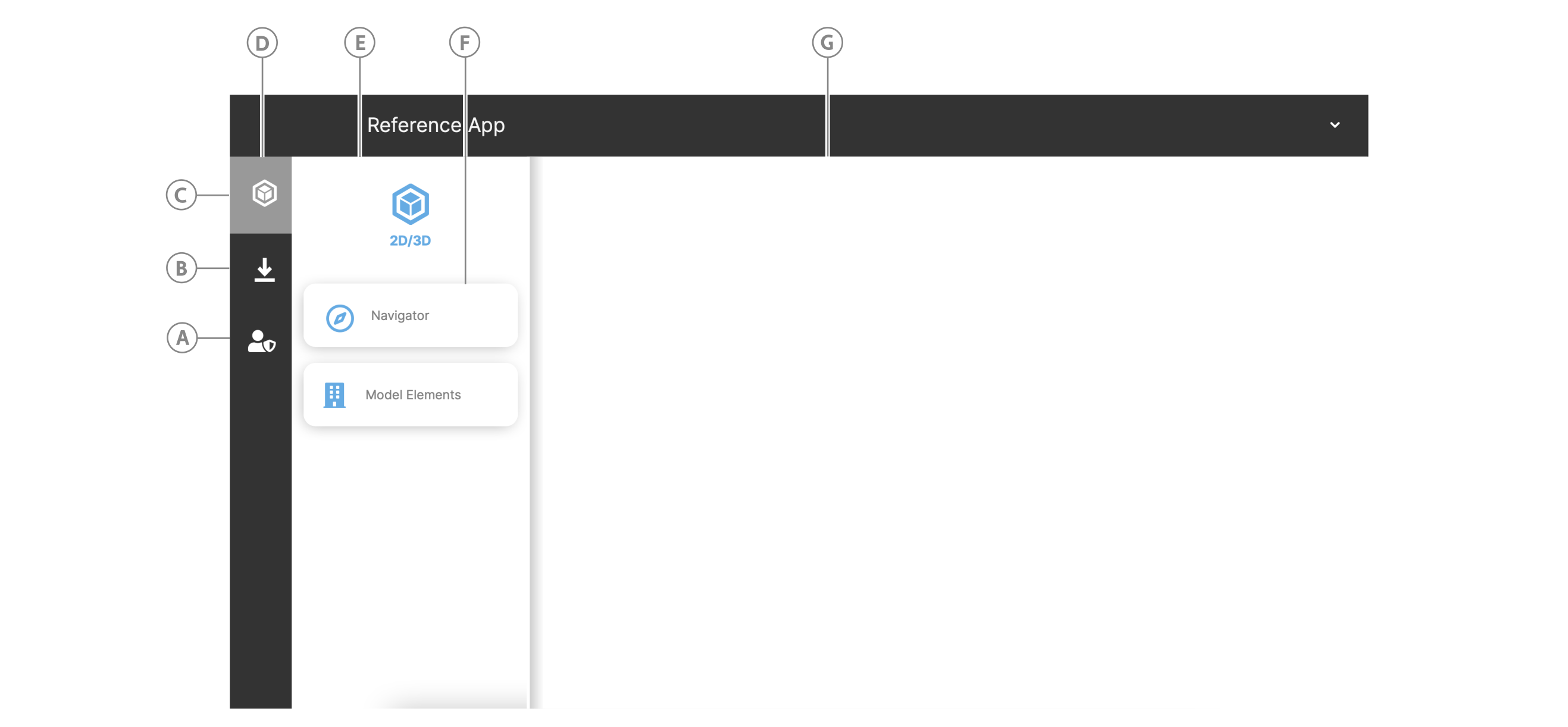
| Callout | Section | Description |
|---|---|---|
| A | Admin icon | View the object model on the Manage Model page or manage users and user groups on the User Groups page. |
| B | Downloads page | View your downloaded files. |
| C | Model icon | View the model on the Navigator page or search, fetch, group, and filter model elements and view their related data in Model Elements page. |
| D | Navigation view | Click an icon to view any page buttons that are grouped in the navigation drawer. |
| E | Navigation drawer | Contains page buttons for pages that are semantically similar. |
| F | Page button | Click a page button to open the page. |
| G | Page layout | Opened pages appear here when you click a page button. The home page appears when the user logs in. |