Dashboard View
| Name | Description |
|---|---|
pageComponent | Activates the Dashboard View. |
layout | Specifies the dimensions of the grid. |
component | Used with a fullpage layout to specify the single component that renders the view. |
panels | Used with a grid layout to specify the content and position of the panels that make up the view. |
preloadImages | Used to load images more quickly that may be displayed on the dashboard. |
headerInfo | Used to load images more quickly that may be displayed on the dashboard. |
pageComponent#
Use 'pageComponent: ‘dashboard'/DashboardView’ in a handler to activate the Dashboard View.
This view is designed to allow the configuration author a certain amount of control over the layout of the page as well as the page content (compare with the Entity View that allows configuration of the content but not the layout).
The config section of the Dashboard handler has two main sections the layout and the components (the components provide the content).
There are two layout modes available:
fullpage- the simplest config to allow whatever component is chosen to simply fill the entire page.grid- the page is split into the specified number of rows and columns to give a set of “grid slots” of equal size. Each component on the page is contained within apaneland thepanelcan be configured to span a group of gird slots (by providing a top, left, bottom, and right set of column/row numbers). This is based on one of the common CSSdisplay: gridusage patterns.
config#
layout#
Specifies the dimensions of the grid.
layout: { mode: 'grid', className: 'homepage' rows: 4, columns: 3,}Configuration#
mode: eitherfullpageorgridclassName: (optional) a CSS class name applied to the pagerows: required forgrid- the number of rowscolumns: required forgrid- the number of columns
component#
Used with a fullpage layout to specify the single component that renders the view.
config: { layout: { mode: 'fullpage' } component: 'ChartTestPage'}panels#
Used with a grid layout to specify the content and position of the panels that make up the view.
config: { layout: { mode: 'grid', rows: 4, columns: 3 }, panels: { myfirstpanel: { reactor: true, component: "AComponent" // component configuration }, asecondpanel: { position: {top: 1, left: 1, bottom: 4, right: 3}, reactee: true, component: "AnotherComponent", // component configuration } }}Configuration#
key: A name for this panelposition: The position of the panel specified using “grid line numbers” with the topmost line being 1 and the leftmost line being 1. The rightmost line will be the number of columns plus 1, and the bottommost will be the number of rows plus 1.component: The component used to render the contents of the panel.component configuration: This is dependent on whichever component is chosen (see above)reactor: (optional) true/false, whether or not the panel will be handed anonClickhandler to pass data back up to the DashboardView, which will then be handed down to any panels marked asreactees.reactee: (optional) true/false, whether or not the panel will be handed a reactInfo passed down from the DashboardView.
Notes#
If no position is provided the grid is filled from the top left one grid slot at a time in a left-to-right order.
preloadImages#
Used to load images more quickly that may be displayed on the dashboard.
preloadImages: [ "ikon-spaces-chem-lab.jpg", "ikon-spaces-ikon-workspace.jpg", "ikon-spaces-entrance.jpg"],Configuration#
An array of file names to load.
headerInfo#
Used to display a dashboard title and optionally a navigation button at the top of a dashboard.
headerInfo: { title: "Analytics | Comfort & Wellness | Temperature", navButton: { title: "View System", action: { type: "navigate", navigateTo: "diagnostics" } }},Configuration#
title: the title of the dashboardnavButton: (optional) the config for the navigation buttonnavButton.title: the title to display in the buttonnavButton.action: thenavigateToaction
Examples#
Fullpage#
handlers: { charts: { title: "Chart Tests", icon: "icofont-pie-chart", shortName: 'chart-test', description: 'Chart Tests', pageComponent: 'dashboards/DashboardView', path: '/charts', config: { layout: 'fullpage', component: 'ChartTestPage' } } }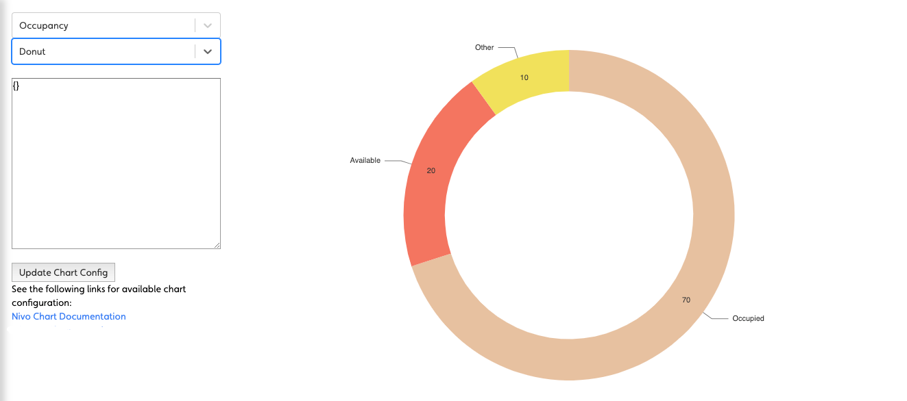
Simple Grid of Panels#
handlers: { dashboard: { title: "Mission Control", icon: "icofont-rocket", shortName: 'dashboard', description: 'Sample Dashboard', pageComponent: 'dashboards/DashboardView', path: '/dashboard', config: { layout: 'grid', // <-- using a grid rows: 2, columns: 3, panels: { panel1: { component: "BlankPanel" }, // <-- no positioning just defaults to one cell per component panel2: { component: "BlankPanel" }, panel3: { component: "BlankPanel" }, panel4: { component: "BlankPanel" }, panel5: { component: "BlankPanel" }, panel6: { component: "BlankPanel" } } } }}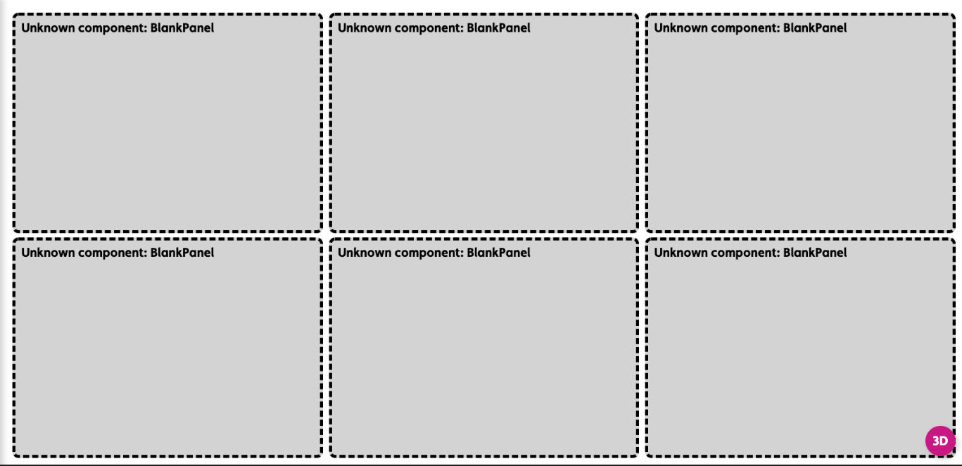
A Homepage style Dashboard#
handlers: { homepage: { title: "Homepage", icon: "icofont-home", shortName: 'homepage', description: 'Home', pageComponent: 'dashboards/DashboardView', path: '/homepage', config: { layout: 'grid', // <-- use a grid className: 'homepage', rows: 4, // <-- of this size columns: 3, panels: { properties: { position: {top: 1, left: 1, bottom: 4, right: 3}, // <-- position the component on the grid component: "PropertyCarousel", script: "getProperties" }, charts: { position: {top: 1, left: 3, bottom: 4, right: 4}, component: "ChartStack", charts: [ { chart: "Donut", script: "getOccupancy", colors: [], title: "Space", centerItem: "Occupied" },{ chart: "Bar", script: "getCapExForecast", colors: [], title: "Capital Expenditure Forecast" } ] }, buttons: { position: {top: 4, left: 1, bottom: 5, right: 4}, component: "BigButtonBar", actions: { Navigator: { allow: true, icon: 'nav-svg', type: 'navigate', navigateTo: 'navigator', title: 'Navigator', text: 'Explore the building model and related data' }, Assets: { allow: true, icon: 'asset-svg', type: 'navigate', navigateTo: 'entities', title: 'Assets', text: 'Detailed asset data for operations and capital planning' }, Spaces: { allow: true, icon: 'spaces-svg', type: 'navigate', navigateTo: 'spaces', title: 'Spaces', text: 'Spatial configuration and related data' }, Files: { allow: true, icon: 'files-svg', type: 'navigate', navigateTo: 'docs', title: 'Files', text: 'All property files for operations, property management, etc.' } } } } } }}